The Craft of Calm Interfaces
How spacing, hierarchy, motion, and restraint quietly make users trust your product — before they even read a word.
There's a specific feeling you get when you land on a well-designed interface. Nothing jumps at you. Nothing begs for attention. You just... know where to go. That quiet confidence in a product isn't magic — it's craft. It's the result of deliberate decisions about space, visual weight, movement, and — most importantly — what not to do. This journal note is about that craft: designing interfaces that feel calm, composed, and trustworthy.
The Noise Problem Nobody Talks About
Most interfaces aren't broken — they're just loud. There's a button competing with three other buttons. A notification badge wrestling with a tooltip. An animation playing that nobody asked for. None of these elements are individually catastrophic, but together they create cognitive friction — a subtle, exhausting kind that users never articulate but always feel.
"Calm technology doesn't demand your attention. It works at the periphery of your awareness, stepping in only when needed." — Mark Weiser & John Seely Brown
This is where calm interface design begins: not by adding better elements, but by questioning whether each element has earned its place on the screen.
Spacing Is Not Empty — It's Structure
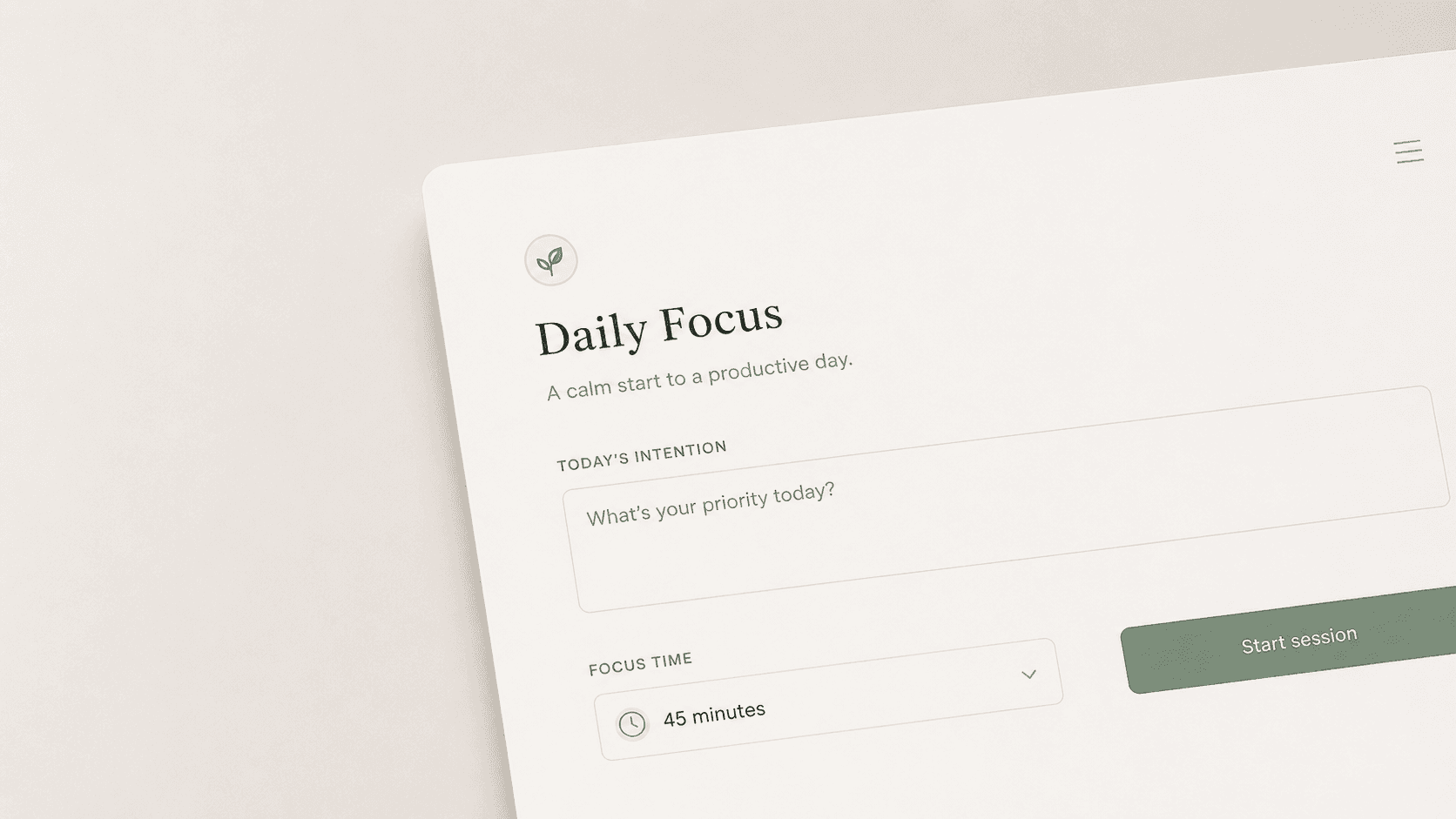
Whitespace is the most misunderstood tool in a designer's kit. Junior designers see it as wasted room. Senior designers treat it like load-bearing architecture. Generous spacing between elements tells the eye: these things are separate, process them independently. Tight, cramped layouts create visual tension — the brain works harder to parse what belongs together. That extra effort, multiplied across dozens of micro-interactions per session, adds up to a product that just feels exhausting to use. The principle is simple: space creates trust. Luxury brands have known this for decades — a product displayed with room to breathe signals quality. The same logic applies to your padding-block values.
"Whitespace is to design what silence is to music. Without it, everything blurs into noise."
In practice: start with more space than feels comfortable, then reduce. You'll almost always stop before you thought you would.
Visual Hierarchy: Guiding Without Forcing
A calm interface never shouts. It leads. Visual hierarchy is the art of making the most important thing the most visible — not by making it louder, but by making everything else quieter. Contrast, size, weight, and color can all do this work without triggering a single alarm bell in the user's head. When hierarchy is broken, every element feels equally important, which means none of them are. Users stall, scan randomly, and make mistakes. When hierarchy is clear, users move through a flow almost on autopilot — which is exactly what you want. A useful mental test: the squint test. Blur your eyes at your own interface. Can you still tell what the primary action is? If you have to re-focus to find it, your hierarchy needs work.
"Good design is invisible. The user should never notice the design — only the experience."
Motion That Earns Its Keep
Animation in UI is a responsibility, not a decoration. Motion that serves function — a drawer sliding in to communicate origin, a toast notification fading out to signal resolution, a skeleton loader pulsing to communicate that something is happening — builds a mental model for the user. It answers the question: where did this come from and where is it going? Motion that serves ego — dramatic entrance animations, bounce effects on every click, parallax just because you can — trains users to wait for things to stop moving before they can act. It's the UI equivalent of someone who does a full dramatic pause before answering a simple question.
The rule of thumb: if removing the animation makes the interface feel broken or confusing, it's functional. If removing it just makes it feel less "fun," cut it. Calm motion is also about duration. Anything under 100ms is imperceptible. 200–350ms feels snappy and intentional. Over 500ms for a routine transition starts to feel sluggish. Speed communicates confidence.
Restraint: The Hardest Design Decision
Restraint is not passivity — it's the result of having said yes to twenty things and choosing to say no to nineteen of them. Every feature request, every extra color, every additional font weight added to a design system slightly raises the cognitive load for the user. Not dramatically — just by a little. But interfaces don't fail dramatically. They degrade quietly, one exception at a time, until the product that once felt clean now feels cluttered and nobody can quite explain why.
"Perfection is achieved not when there is nothing more to add, but when there is nothing left to take away." — Antoine de Saint-Exupéry
Restraint in practice means: one primary action per screen. One brand color used purposefully. Iconography that supplements labels — not replaces them. Feedback states that inform without alarming. Restraint is what keeps a design system coherent six months and ten contributors later.
Space is structural, not decorative
Generous whitespace reduces cognitive load and signals quality — treat it as a first-class design element, not what's left over after you place everything else.
Motion should answer a question
Every animation should help the user understand where something came from, where it went, or what is happening. If it doesn't do one of those things, it's working against you.
Trust is built through restraint
A calm interface earns user trust not by doing more, but by knowing exactly what to leave out. Every element you remove that doesn't need to be there is a gift to the person using your product.
The interfaces users love most aren't the ones that impress them — they're the ones that don't get in the way. Building calm, composed digital products is a practice of subtraction as much as creation. It takes more deliberate effort to design less than to design more. But when you get it right, users don't notice the design at all. They just feel like they're good at using your product. And honestly? That's the whole point.